"A lot of filmmaking can be linked to prestidigitateur, you
know – a shuffling the cards. And that's a marvellous thing.
But if you say [adopts campy voice], 'Oooh, shall I show
you how I do that?' Then it kills the wonder of something." |
|
"We're constantly taken by surprise. And in the best science
fiction or fantasy you can never really second guess it
because
it does away with all the expectancy of behaviour." |
Director Nicolas Roeg, SFX Magazine Interview 1999 |
Note: Once again, ideas put forward in the body of the review reflect and comment on material later found in the extras or in the commentary. I stand by what I wrote and have not gone back and re-edited despite the fact that what screenwriter Allan Scott says in his interview is absolutely true; good writing is rewriting.
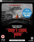
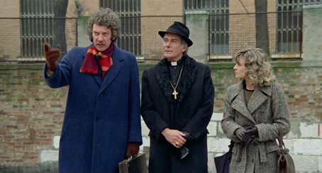
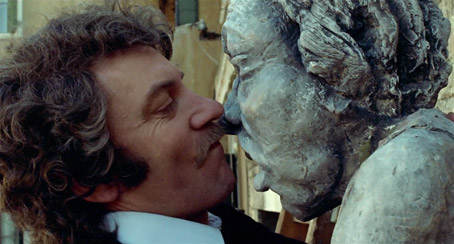
Don't Look Now is just a wonderful title for a movie. It's also a terrific film recalled with a spine tingling chill by many who caught it early. That it started life as the title of a short story by Daphne Du Maurier gives it extra piquancy. Adaptations of her stories have resulted in some truly classic movies; Rebecca and The Birds are the ones that come to mind, both not exactly hindered by the creative participation of a certain Mr. Alfred Hitchcock. Don't Look Now's story centres on the simultaneously empowering and deteriorating relationship between a husband and wife after the drowning of their daughter in a freak accident at their home. Commissioned to restore an ancient church, John Baxter (Donald Sutherland) moves to Venice (that's Italy not California), with his wife, Laura (Julie Christie). Both are still engulfed by grief and Laura is particularly susceptible to the merest glimmer of comfort even if it spookily emanates from supposed supernatural sources. Laura is briefly hospitalised after a meeting with two sisters (one of whom is blind so can 'see' in other ways) who maintain that they are in contact with Christine, the Baxter's dead daughter. Séances are held, things get seriously prised apart and a man of reason pays the cinematic price for ignoring aspects of his life that cannot be contained by logic and common sense. In short, the signs were there but they were unheeded.
My introduction to this classy occult thriller was about the best advanced publicity a scary movie could hope for. I returned home, a young teen, to find my older sister alone in her room in a corner, curled up in some sort of foetal distress. In front of her was a black and white portable TV (can you believe we used to haul that sucker into the bathroom so we could soak and view? It seems like madness now). The end credits of Don't Look Now were scrolling over a very grey Venice background with Pino Donaggio's lush strings accompanying them. Ah, remembered moments are always somewhat embellished. Having seen the film a few times very recently, I have to say that the credits don't scroll... But to see my older sister in that terrified state stayed with me. Here was a film I had to see but again, like The Texas Chainsaw Massacre, its advanced promise of fear had time to course through me but I did see it at a retrospective screening and was totally knocked out by, most of all, Roeg's command of screen time via an editing style that has always impressed me. Associative editing, when there is meaning implied and subtext to be gleaned, is a thing of rare beauty and Roeg (and his editor Graeme Clifford) excel at this in Don't Look Now. In fact the film is absolutely stuffed with meaning, portent and subtext which means that it can be seen many times, each viewing revealing something different of Roeg's intent – some of the cuts themselves are shameless scene stealers.
"Nothing is what it seems..." is a (or even 'the' according to Roeg) common theme throughout the film and we're only a minute in and we get our first example of this. One of the toys du jour of the early 70s was a fully articulated 'Action Man' (basic versions in time gave way to those with 'gripping hands', realistic hair (!), a smoothed piece of articulated plastic where genitalia may have been and the pull-string soldier's voice urging his fellow fighters to "Dig in!"). Well, in the introductory scene not only is the daughter playing with the toy, it speaks with a woman's voice... And one of the orders given by the toy is horribly prescient: "Action Man Patrol, fall in..." Before we've really got going, there are associative cuts to relish. Red coat in a slide to red raincoat reflection, water to glass, a mix showing a small dead, red-stockinged foot bleed into the water damage on the slide, water that seems to have become blood red. The cumulative effect of these transitions elicits both a very reassuring feeling that you're in the hands of a master film-maker and the awful terror of losing a child (and not just in Debenhams although that is stressful enough).

There is a masterful edit at about 4 minutes and 7 seconds in – a ball is thrown, jump cut to cigarettes thrown. Despite ball and cigs heading in opposite directions, the effect is to anchor the child in the red Macintosh as the daughter of these two happily married people. To enforce this, there's even an earlier cut where Julie Christie's 'fingers to lips' physical mannerisms are deftly compared with an intercut of her daughter. We are in genuinely gifted hands here and yet something Roeg mentioned is peculiarly relevant. A lot of these editing opportunities are just that – opportunities. Is it an art to plan these transitions way ahead of time (like David Lean's formal and singular editing decisions) or to let the film breathe and find these cuts once the rushes are in? I have a feeling Roeg and editor Clifford belong firmly in the latter camp. It's still exhilarating to watch. Roeg/Clifford even underscore the first portent with the ark of the ball landing in the water intercut with Sutherland's knocking over a glass which adds a disturbing element to an already unnerving slide of what looks like a child in a red coat sitting upright in church seen from behind. The movie is full of these superb segues but not for any aspirations to MTV speed-cut fashion status. They are integral to the inner workings of the characters and also propel the narrative forward with some style.
Let's take a somewhat inevitable look at the scene that has plastered Don't Look Now to the notice board of cinematic censorship. Yes, it's sex again. To the filmmakers' annoyance, Don't Look Now is unjustly famous for a very candid but not hugely explicit sex scene. Another example of cinematic serendipity, the scene, barely (ooer) four minutes and fifty-two seconds long, is one of a loving partnership between a husband and wife. In one of the accompanying interviews, lead actor Sutherland is very explicit when he calls the scene 'conjugal' and not 'sexual'. What makes it exceptional of its kind is the editing, a style enforced upon the filmmakers because of censorship at the time (or so one story goes. It's a story I'm beginning to doubt upon learning that the couple's dressing in the intercut material was shot at the same time as the naked intertwining therefore making it unlikely it was used as a fop to the censors). With this scene, who knows the truth anymore? For some utterly bizarre reason, what authorities had (and still have) against sex on screen is the 'up and down' nature of fornication. So Roeg and Clifford intercut the act with the couple dressing taking out any north-south physicality that might have corrupted all those in the audience who'd never had sex before. I say serendipity because the filmmakers could not have planned this beforehand. The intercutting is what makes the scene extraordinary because of the implied subtext. The physical manifestation of intimacy and love is given strength and credence by the everyday acts of choosing the garments to cover naked bodies. The associative actions and their cuts make the entire sequence feel like a dance. On more than one occasion I was reminded of one of the most brilliantly edited sequences of modern cinema; David Bretherton's 'Slap Dance' from Bob Fosse's sublime Cabaret.
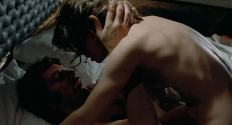
Don't Look Now's sex scene is made more erotic by the suggestion that this is an everyday activity not a morally dubious 'porn' event. The 'conjugal' scene is to pornography as an iced glass of water is to a country wrecking tsunami. Yes, naked flesh, yes, loving caresses, yes, the mere off screen hint at cunnilingus but this is cinematic love not exploitative "in-out, in-out". The fact that it is undeniably erotic is actually in its favour. Pornography rarely reaches the heights of intimate eroticism. It's more like a gym work out. What Sutherland and Christie achieve here with an extraordinarily naked honesty is the almost throwaway exhibition of intimacy, something I've not seen in a movie since this scene was shot. And in case you don't get this, the music should help you get past the 'porn' tag to something more meaningful in terms of character. There's a shot of Sutherland doing up his tie and walking past Christie in the foreground – a tiny look... As the 80s super-band ABC might have sung, it's 'the look of love.' That look makes all the difference. It's also screen acting at the highest levels.
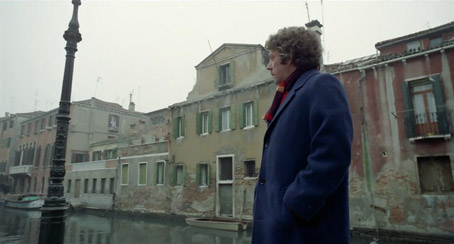
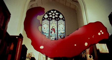
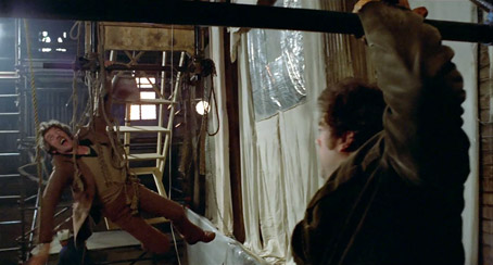
The movie's standout set piece still delivers after all this time. If you're new to the film, I won't spoil it but there's a touch of The Omen about it (think of Patrick Troughton's demise) but I think it works so well because it is quite clearly Sutherland appearing to be in considerable danger (there is some scuttlebutt that the stunt was deemed too dangerous) and Roeg would not be able to get away with endangering his leading man like that these days. Even though I knew it was coming, it is still a very effective shock and the tension is maintained throughout. Once Sutherland starts the search for his wife, Venice itself starts asserting itself as a definable character. Despite the grey skies (or because of them, the jury's still out on this one), its role in the film is dramatically vibrant and defiantly unnerving. Roeg also uses the colour red to play with the audience's expectations. The colour, embossed on our memory, is of course the signature of Christine the dead daughter whose bright red Mac becomes the image Roeg plays with throughout the film. His use of the colour foreshadows M. Night Shyamalan's own red clues in his The Sixth Sense. Of course, we must remember what colour the herrings are, too. The only disappointing red in the movie is the grading of blood but we'll not go down that alleyway for the benefit of newbies.
There is a great deal made of the absence of red in the movie in all the Extras. I will take some issue with what's claimed by the filmmakers despite feeling happily manipulated by the cinematographer and director. According to Roeg and said cinematographer Anthony Richmond, the colour only ever asserts itself when there is danger about. If you take a careful look at Don't Look Now, it's clear this 'rule' is somewhat arbitrary. Red appears in the film in many different scenes and situations. Not to belabour the point but why make a behind the scenes issue about something when it can be so easily disproven? Red is a striking colour and is notable in the film because of its association with the dead daughter Christine's Macintosh and the (spoiler which I will not spoil). But it's also very clearly visible as (deep breath)...
...a third of the hero's scarf, the heroine's knee length boots, the garb of many arrivals at the airport once Julie Christie returns to Venice, the scaffolding pole and interior of the suitcase in the church Sutherland is renovating, the crowd's garb at one of the murder victim's scenes, the red clothing on the washing line, the red carpet in the hotel and all the red velvet on display at the Catholic office where mitres and papal hats are gleefully zoomed in upon. In short, the idea that "the red was screened out in most scenes" argument doesn't hold that much water (naturally for a film set in Venice) but with a film with this much class and effect, who cares how many red items a completist nonce like me can spot?
There are a few notable aspects of this movie that fix it in time. After all, it's 38 years old. Let's not worry too much about the flares (sartorial not optical) and yes, Roeg treats us to a few cheesy zooms that squeal Roquefort but on the whole, you could use the word timeless and not get too many dissenting howls. Don't Look Now has a refreshing looseness to its style. For 1973, some of Roeg's jittery camerawork presaged the era of the 'wobble-cam' (though in a far more subtle and watchable way). It's good to remember that Roeg was David Lean's cameraman of choice until one small but oft-reported exchange rent them apart. Again, this could be taking the myth but apparently Lean said to Roeg one day "You think I'm old fashioned..." and that was it, the end of any further relationship between the two men. Roeg's choice of composer and style of score is by no means old fashioned. It was to be Pino Donaggio's debut at film scoring. He would later go on to score for Brian DePalma and Joe Dante as well as scoring scores of scores for Italian filmmakers. The romantic Italianate main theme is re-quoted quite a few times which sits it squarely in your memory (god, music is so evocative – I only have to hear that little synthesized five note sting and I'm in Venice in fear of my life). Donaggio's ability to swim against the movie's DNA means that his score is often used in counterpoint to the accompanying visuals. Roeg, as an artist, is nothing if not a contrarian. But if by going against received wisdom is a necessity for any artist then one of Roeg's greatest creative decisions in Don't Look Now (from my point of view) is to have Julie Christie betray the smallest smile in the end scene. I won't reveal why but you'll know what I mean when you see it. Sublime. Roeg allows the audience to see an open door of possibility. Assumed readings of any kind must be challenged if not in life then always on screen.
The Blu-ray starts off with two trailers, the first is a promise of more classics to be remastered. I think I started to drool. The second is the full old-style trailer for Peeping Tom. What about the picture quality of the main feature?
There are some issues on both fronts but it's generally good news for Roeg fans. A good 2K scan of a decent negative or inter-negative can yield spectacular results but we are talking of stock limited by its own era. I still am impressed at the quality of most of the film given it had been shot on 35mm with a film speed of 50 ASA (we have stock ten times more sensitive to light now). But grain in high definition is highly defined grain and in some shots it does detract. It's really a question of how far you sit from your TV. You must be at that optimum distance (no pun intended) where the high def image is impressive and the grain at its least intrusive. Any optical work in the film (where several passes are made to add elements to the frame) has scrubbed up nicely. There is a tendency for older movies to advertise their effects because the grain suddenly gets more noticeable. But for lovers of this movie, there is that wonderful first shot of Christine in her red Mac that catches your breath.
Part of the marketing states that Roeg himself oversaw the digital restoration (both picture and sound). The soundtrack is based on the original Mono and in its new Dolby Digital 2.0 coat, there is no direct evidence of a full remix but the sub woofer does come out to play on several occasions but as I've been told, this could be my older amplifier recoding the soundtrack based on my own hardware set up. The sound is highly centre-centric and still has that hint of a high-end metallic sharpness that also dogged the 2006 DVD release but it never detracts because the movie is too good for that. I know it's basic but as long as you can make out the dialogue, there are no issues with the sound. We are spoiled in these days of domestic surround systems and if classic movies can't get a full 21st century remix, then having the original treated with some respect will do fine from my own point of view. It's just great to have the extra picture quality.
Speaking of the 2006 DVD release...
The following features have been ported over in Standard Definition from the re-mastered 2006 DVD. The 16 page booklet written by Ryan Gilbey, I suspect, will also come with the Blu-ray package but as I have a review copy with no bells and whistles, I can't be sure.
1. Commentary by director Nicolas Roeg
I had the pleasure of attending a screening of Roeg's Eureka in Bristol some years ago with the director in attendance. He turned up, thunder in his eyes, after the screening to announce that his movie had been projected in the wrong aspect ratio. Despite that kick in the sprockets, he was a lively, smart and open speaker. I looked forward to his thoughts on what may be one of his best films. In 2006, Roeg was a stately but sprightly 78 year old and there are a few moments in the commentary (chaired by an obviously awed Adam Smith doing the prompting) where his words are difficult to discern. Here are some gems...
On the actor Nicholas Salter who played the couple's son, "...little boy had a rather sad life." And then he tells us no more!
The idea of being able to work on films in the 60s and 70s... "Film was a secret affair..."
But my favourite has to be Roeg's wonderful summing up of criticism, something that writers on this site must be all too well aware of... "Criticism," he growls, "...is another form of autobiography!" Marvellous.
2. Introduction by Alan Jones (7' 11")
Jones is one of the genre's champions and his writing has been a constant companion to my ever-burgeoning enthusiasm for horror. He was the London correspondent for the late and well-lamented Cinefantastique magazine. Yes, it's mutated into a web site but, hey... the magazine is still missed. We'd met several times on film sets, the shop Forbidden Planet (when it was a twentieth of the size it is now) and curiously at the SFX convention a year last February. His introduction is a curious thing. He's obviously reading from cue cards off screen and has a playful relationship with his director and/or camera person. But as a genuine voice of authority on this subject, Optimum picked the right guy. He covers the following with a few minutes on each...
Adapting Du Maurier - Nic Roeg - The Story - More Than A Horror Film - That Scene - Music and Location - Conclusion.
3. Looking Back – documentary on the making of the film (19' 31")
This © 2002 effort is simply a few interviews with key personnel featuring information Roeg naturally repeats on his commentary track. I sound like I am dismissing it – not my intention. The raw material – the complete unedited interviews – has been presented as an extra Extra and the most bizarre exclusion is the one with Roeg himself (unless of course they used it all in this short).
4. Interview with composer Pino Donaggio (17' 35")
The charming Pino Donaggio (once a singer/songwriter who gave Dusty Springfield her pop hit "You don't have to say you love me," takes us through his involvement with the film (again, fate and chance seem to be the primary movers in this tale). His studio is right on the Grand Canal and his view reminds me that I must get to Venice at some point in my life. Like The Prisoner's Village in Portmeirion, it is a standing movie set that would have to try very hard not to remind me of second sight and malevolent... oops, trying to keep this review spoiler free.
5. Trailer (2' 31")
Scratched to smithereens and in places cut with a demented blender, this rather up-market and almost pretentious slice of 70s selling sounds like it's voiced by Michael Jayston. There are lines like "A thin thread of life in a skein of death..." Who writes stuff like that any more? Wonderful!
***
As far as I'm aware, the following Extra Features make their debut on this Blu-ray edition.
1. Compressed version of Don't Look Now made by Danny Boyle for BAFTA tribute (4' 31")
This is Danny Boyle's work starting and ending with Donaggio's score but filling the rest of the compressed version with a modern track I didn't recognize. Why BAFTA asked for this (perhaps it was offered) is beyond my comprehension. Isn't it a bit like honouring the fastest man alive with a slow motion clip? Why would anyone want to see Don't Look Now in 4 minutes and 31 seconds? I'm obviously missing something here.
2. Interview with Danny Boyle (15' 10")
This is what I'm missing. Boyle states that all films should be compressed to their essence (why?). Perhaps as a sort of game? It's clear from this short interview that Boyle takes his art and craft seriously which in these times of irony and "whatever"s is refreshing. He calls Roeg a cinematic Picasso and Don't Look Now "...the moment when movies moved forward." I think I know what he means. I especially liked (as I would as I have been banging on about it on this site for years) his comment that the film is... "much more profound than perfection."
3. Interview with co-screenwriter Allan Scott (14' 31")
Scott is quick to inform us that he is a man who generally wears two hats. He's also a producer. What's fun about his participation is his careful division of credit. A Roegian cut for example (Laura's scream to a drill in Venice) is in truth a 'Scottian' transition (as it was written in the screenplay exactly as cut). Let's not diminish his partner's input here either, Chris Bryant. Scott made a remark that I could also sympathise with. He said that to his knowledge most of the people he knew with a passion for the arts started young. It burns brightly from a very early age. No one seems to have graded these interviews (or if they have, they come from planet Cheese). Scott looks as yellow as the Simpsons.
4. Interview with director of photography Tony Richmond (23' 48")
Having some technical curiosity, I most enjoyed this interview. I have an affinity with those who learned film the chemical way, the old fashioned hands-on way. We all seem to see the modern advances in filmmaking slightly askance. Yes, it's a rosy view, a nostalgia probably born from a frustration but when he started to talk about his grading options in 1973 and then listed what was possible now, he actually said (I'll leave it to you to decide if any irony was intended) "It was better then..."
5. Interview with leading man Donald Sutherland (23' 14")
Now a grand old Thespian, Sutherland fills his role with great dignity. Among the many wonderful anecdotes are little nuggets that slip past that wouldn't have occurred to you in decades (as well they did not). Sutherland's curly mop (I assumed his own, the same he sported in Phil Kaufman's terrific remake of Invasion of the Body Snatchers) was a bloody wig! His stunt man story is a real eye opener but I was left with two very specific stories and they're both touching in their own way. Despite conflicting reports about whether sound was taken for the sex scene or not (with the recordists demurely sitting outside), Sutherland describes an unblimped Arriflex 35mm camera sound with great theatricality. Imagine a plastic strip being held in place 24 times a second. It 'tickers' but it also 'whines'. Sutherland does a great impression underlying the essential 'unsexy' nature of the scene. He states for the record that there was never any reality to the scene just two actors taking off-screen direction. The second part that stayed with me is a great reminder of how people can bond during a movie and that bond stays strong. Sutherland's fourth son is called Roeg. If I were Nicolas, I'd be very moved by that.
6. Nothing Is As It Seems (15' 36")
Here we go... Now apparently this is an extract (entitled 'Sex and Death') from a longer documentary but I can't find any more details just yet. It's obviously from the same era as the feature. It's presumably shot on 16mm film and features a psychiatrist, Colin Murray Parkes, author of 'Bereavement', who wanders through the movie seeing it from his professional perspective. The upside; it's a piece of archive trivia that has its place (it supports the emotional truth of the movie). The downside; it feels lurid and slightly unsavoury and I can't put my finger on why. Maybe it's all those children in red who traipse around in front of Parkes on a park bench. Perhaps it also feels a tad pretentious – any 'reading' of a movie is bound to have its critics. It also uses wholesale chunks of the film to illustrate points and that gets tedious, something I have also banged on about a lot in DVD and Blu-ray reviews. Having said that, as my first complete Blu-ray review, I couldn't have asked for a better movie.
Full marks to Optimum for spending some time scrubbing up Don't Look Now. I suspect we are getting the best that can be got from the older film elements and depending on location and/or exposure, some of the film looks wonderful. Grain is evident but it won't bother most of us. Until a full-blown surround mix is made (I suspect that was a little too much to spend for this pass), this is the best version of Roeg's masterpiece out there and comes heavily recommended.
|